
Styling With Yellow Framed Pictures A Home Decor Guide
A yellow frame is more than just a border; it’s a design choice that can completely transform a room, injecting it with warmth, personality, and a serious dose of optimism. This small detail can be the striking focal point you've been looking for, the perfect element to tie a room's color scheme together, or simply the thing that makes a cherished photo feel even more joyful.
The Surprising Power Of Yellow Framed Pictures
Choosing a yellow frame isn't just about hanging art—it’s a statement. It’s a deliberate move that speaks to confidence and cheerfulness. Just think about the psychology of yellow itself; it’s the color of sunshine, happiness, and pure energy. When you bring that feeling into your home, you're not just adding color, you're actively shaping the mood of the room. A single yellow frame can keep a neutral space from feeling cold or make an already vibrant room feel even more alive.
This is exactly why personalized decor has become such a huge trend. We want our homes to tell our stories and reflect who we are. Custom pieces, like a playful animated portrait from Happy Tooned, feel even more special when they’re housed in a frame that amps up their character. That yellow border acts like a spotlight, immediately drawing your eye and highlighting all the fun and love captured inside.
Why This Vibrant Choice Works
So, what makes a bold choice like a yellow frame so effective? It really boils down to a few key design principles:
- Creates a Focal Point: In a room with a more muted color palette, a bright yellow frame is an instant attention-grabber. It gives the eye a place to land and anchors the whole space.
- Enhances the Artwork: It has this amazing ability to pull out warm tones from a photograph or painting, making the entire piece feel more cohesive and dynamic.
- Tells a Personal Story: Let's be honest, choosing a bright, unconventional color shows off your personality and a willingness to step outside the box of traditional decor.
This growing desire for unique, color-forward decor isn't just a niche trend. In the world of wall art, where personal touches turn houses into homes, yellow-framed pictures have become the cheerful, eye-catching accents that brighten spaces everywhere. The wall art market is booming, and it's projected to skyrocket to USD 145.49 billion by 2034—a clear sign that people are craving framed decor that really pops with color. You can dig into more of these market trends and their growth over on Fortune Business Insights.
A yellow frame doesn’t just hold a picture; it elevates it. It turns a simple memory into a piece of art that radiates positivity, making it an essential tool for anyone looking to create a space that feels both personal and alive.
Choosing The Right Shade Of Yellow For Your Frame
Let's be honest, not all yellows are created equal. Choosing the right one is what will make your artwork truly sing, and the spectrum you can pull from is huge—ranging from soft, gentle tones to electric, high-energy hues. The shade you land on will completely set the mood for your room.
A soft buttercup or a pale lemon brings a light, airy feel to a space. Think of it as the perfect choice for creating a serene, welcoming atmosphere in a nursery or a sun-drenched breakfast nook. These gentler yellows are subtle yet cheerful, adding just a touch of warmth without taking over. I find they work beautifully with delicate artwork like watercolors or classic botanical prints.
This is exactly how a pop of yellow can tap into core emotional elements to warm up a space.
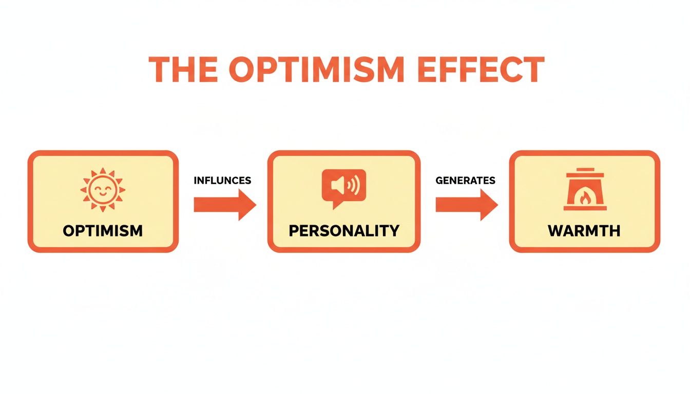
As you can see, the optimism from a simple yellow frame enhances the personality of the art, which in turn radiates warmth throughout the entire room.
Deeper Tones And Bolder Statements
If you're looking for something with a bit more gravity, moving into richer shades like mustard and ochre offers a grounded, sophisticated energy. These earthy yellows just scream vintage, mid-century modern appeal, bringing a real sense of depth and coziness to a living room or study. They pair exceptionally well with black and white photography; the warm frame creates a stunning, dynamic contrast against a monochrome image.
And for those who really want to make a statement? You can't go wrong with vibrant shades like chartreuse or citron. These electric yellows have a sharp, contemporary edge and are fantastic for eclectic or maximalist interiors. A chartreuse frame can turn a simple abstract print or a quirky custom portrait into a high-impact focal point, injecting pure energy and personality into your decor.
Pro Tip: When in doubt, pull a minor color from the artwork itself. If a painting has small flecks of gold or marigold, framing it in a similar shade will create a cohesive, professionally curated look. It just feels intentional and harmonious.
Matching Yellow Frame Tones To Your Decor Style
To make your choice even easier, take a look at your existing interior design style and color palette. A frame's finish—whether it’s matte, glossy, or distressed—also plays a huge role in how it fits into your space. For instance, a glossy lemon yellow frame might feel perfect in a sleek, modern kitchen, while a distressed mustard frame would be right at home in a rustic farmhouse.
To help you out, I've put together a quick reference table. It's designed to help you match the perfect yellow frame to your unique home environment, ensuring your new piece feels like it was always meant to be there.
Matching Yellow Frame Tones To Your Decor Style
| Yellow Shade | Best For Decor Style | Pairs Well With | Finish Recommendation |
|---|---|---|---|
| Buttercup | Shabby Chic, Coastal, Nursery | Pastels, light blues, whites | Matte or lightly distressed |
| Mustard | Mid-Century Modern, Rustic, Bohemian | Navy, forest green, terracotta | Natural wood grain or matte |
| Gold | Art Deco, Glam, Traditional | Black, emerald green, deep reds | Metallic or high-gloss lacquer |
| Chartreuse | Eclectic, Modern, Maximalist | Hot pink, charcoal gray, teal | Sleek high-gloss or minimalist metal |
Hopefully, this gives you a great starting point for finding that perfect frame. The right shade of yellow won't just hold your art—it'll elevate it and bring your whole room to life.
What Kind Of Art Looks Best In A Yellow Frame?
Let’s be honest, a yellow frame isn’t for the faint of heart. It’s a statement. And like any bold statement, it needs the right art to really sing. The trick is all about finding the perfect balance, either through striking contrast or a beautiful sense of harmony.
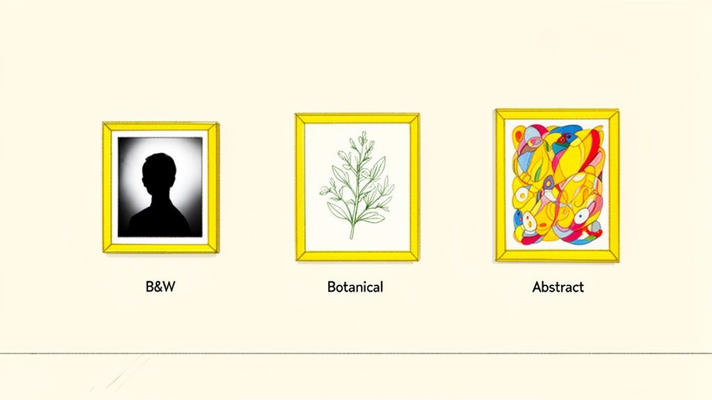
For instance, think about classic black and white photography. The stark, dramatic feel of a monochrome print gets an incredible boost from a cheerful yellow border. It’s a fantastic juxtaposition—the warmth of the frame makes the cool, grayscale subject pop right off the wall.
This same idea works wonders for things like graphic prints, architectural drawings, or even simple, minimalist line art. The clean lines of the artwork get a jolt of energy from the frame, turning what might be a subtle piece into a can't-miss focal point.
Unifying Colorful and Abstract Art
But it’s not just about contrast. Yellow frames can also be the perfect tool to tie together a busy, colorful piece. Got an abstract or impressionist painting with a whole rainbow of colors? A yellow frame can pull out and amplify any of the warm undertones hiding in the art, creating a look that feels cohesive and totally intentional.
Yellow frames are a surprisingly perfect match for a bunch of styles:
- Botanical Illustrations: Those vintage prints with their natural greens and earthy tones look unbelievably fresh and vibrant against a sunny yellow frame.
- Pop Art and Graphic Prints: It’s a no-brainer. The bold, playful vibe of pop art is a natural fit for an equally energetic frame.
- Children's Artwork: What better way to honor your little one’s masterpiece? Framing their art in bright yellow celebrates their creativity and adds a joyful touch to a playroom or gallery wall.
This trend towards expressive, personal decor is huge right now. The art market is expected to hit $944.59 billion by 2033, and a lot of that growth is driven by abstract and colorful pieces. People want art that feels like them, with nearly 53% of U.S. art buyers preferring handcrafted works. This is exactly where custom yellow-framed pictures, especially animated keepsakes, find their sweet spot.
The Perfect Frame for Custom Portraits
Maybe the best use for a yellow frame is for something deeply personal, like a custom portrait. Take a fun, animated-style family portrait from Happy Tooned, for example. It’s already brimming with joy and personality. Wrapping it in a bright yellow frame just cranks that cheerful energy up to eleven, making the memory feel even more special.
A yellow frame is a signal. It tells your guests that the art inside is meant to be fun, warm, and full of personality. That makes it the ideal choice for pieces that celebrate family, love, and all the happy moments in between.
Whether it’s a goofy caricature of your pets or a group portrait of your family in their favorite cartoon style, the frame becomes part of the story. It’s all about making the right choices to turn a simple picture into a treasured keepsake, and you can learn more about how to use custom portraits for maximum impact.
How To Design A Room Around Yellow Framed Art
So, you’re ready to make your yellow framed pictures the star of the show? Fantastic. Designing a room around a single piece of art can feel a little daunting, but I promise, it's way simpler than it seems. It's not about making everything match perfectly. Instead, think of it as creating a conversation between the art and the space it lives in.
The key is to treat your framed piece as the anchor. Let its energy and vibe guide your other decor choices.
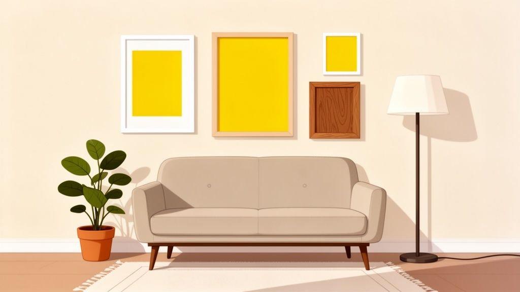
A yellow frame is a bold choice, which is great because it gives you a clear and exciting starting point. Think of it as your room's "main character." Every other element—from the throw pillows on your couch to the area rug under your feet—is there to support it. This approach is what makes a room feel intentional and cohesive, rather than like a random collection of stuff you happen to own.
Building Your Color Palette
The first question I always get is, "What colors won't clash with a yellow frame?" You have more flexibility here than you might think. Instead of trying to find the exact shade of yellow to repeat everywhere, let's focus on creating a balanced palette.
- Cool Complements: Colors on the opposite side of the color wheel, like a deep navy, charcoal gray, or even a rich plum, create a stunning and sophisticated contrast. A yellow framed picture against a navy accent wall is a classic designer move for a reason—it's dramatic and totally timeless.
- Harmonious Neutrals: If high contrast isn't your vibe, lean into warm neutrals. Cream, beige, and soft greige provide a calming backdrop that lets the yellow frame shine without competing for attention. This is how you get that cozy, sun-drenched atmosphere.
- The 60-30-10 Rule: This is a foolproof interior design trick that always works. Your dominant color (think walls) should make up about 60% of the space. A secondary color (furniture, rugs) takes up 30%, and your accent color (that awesome yellow frame and a few other pops) is just 10%.
A pro tip I always share: don't be afraid to pull secondary colors from the artwork itself. If your custom portrait has little hints of blue in the background, weaving that same blue into your decor through cushions or a vase will tie everything together beautifully.
Smart Placement and Lighting
Where you hang your art matters just as much as what's inside the frame. The goal is maximum impact.
Hanging a single, powerful piece at eye level right above a sofa or a console table instantly establishes a clear focal point. For smaller spaces, I love placing a yellow framed picture in an unexpected spot, like a hallway or an entryway. It adds a surprising burst of joy where people least expect it.
Lighting can also completely change how the color yellow appears in a room.
- Natural Light: Sunlight will make your yellow frame feel bright, airy, and full of energy.
- Warm Artificial Light: Lamps with warm-toned bulbs will bring out the golden, richer undertones in a mustard or ochre frame, making the room feel much cozier at night.
- Cool Artificial Light: Cooler LED lights can make a lemon or chartreuse frame appear sharper and more modern.
Creating A Dynamic Gallery Wall
One of my favorite ways to integrate yellow framed pictures is within a gallery wall. Mixing and matching different frames is what adds texture, personality, and a ton of visual interest.
Don’t just stick to one color! Pairing your yellow frames with a mix of black, white, and natural wood frames creates a curated, eclectic vibe that feels like it was collected over time. This approach also keeps the yellow from becoming too overwhelming.
For a deeper dive, check out our post on creating amazing family portrait gallery wall ideas. A well-designed gallery is one of the most powerful ways to tell your family's story.
Alright, you've got the vision, and now for the fun part: the hunt for that perfect yellow frame. The good news is, you’re not short on options, whether you're after a quick and cheerful find or a completely custom showstopper. What you choose really just boils down to your budget, your timeline, and what your artwork needs.
For a quick win, ready-made yellow frames are your most direct route. Big box stores like Target, IKEA, and Michael's almost always have standard-sized frames in a rotation of popular colors. This is a brilliant move if you have a common print size, like an 8x10 or 16x20, and just want to get your art up on the wall without a fuss. The only trade-off? You might find the selection of specific yellow shades and materials a bit limited.
Finding Custom and Online Solutions
When you’ve got something truly special or an odd-sized piece of art, a custom framing shop is the way to go. Local framers are experts for a reason. They can walk you through picking the perfect shade of yellow, the ideal mat width, and even the right type of glass to protect your piece. This is hands-down the best route for valuable or sentimental art, like an original painting or a one-of-a-kind Happy Tooned portrait that deserves to look its absolute best.
Online services like Framebridge or Simply Framed have carved out a fantastic middle ground. You can upload a digital file or mail in your physical art, and they take care of everything, shipping a professionally framed piece straight to you. Their online tools are great because you can play around with different frame and mat combinations on screen, which really helps take the guesswork out of it.
Quick tip: Don't sleep on thrift stores and flea markets. A can of spray paint and a little bit of vision can turn a dated, ornate frame into a vibrant, modern yellow masterpiece for next to nothing.
What’s It Made Of? Matching Materials to Your Style
The material of your yellow frame makes a huge difference in the final vibe it gives off. Each one brings its own unique look, feel, and price tag to the table.
- Wood: Always a classic choice. Wood adds a certain warmth and organic feel that’s hard to beat. A painted yellow wood frame can be anything from rustic and charmingly distressed to crisp and modern, all depending on that final finish.
- Metal: Usually made of aluminum, metal frames offer a slim, sleek, contemporary profile. A yellow metal frame has a clean, almost minimalist look that feels right at home with modern art and photography.
- Composite/MDF: These engineered wood options are the workhorses of the framing world. They’re a budget-friendly alternative to solid wood, are incredibly durable, and come in a massive range of styles. Perfect for getting a specific look without breaking the bank.
When you’re ordering a custom piece of art, like a digital portrait that you plan to print, measuring carefully is key. A common mistake is forgetting to account for a mat. A mat adds that little bit of breathing room between the art and the frame, giving it a much more polished, gallery-like feel. A good rule of thumb is to plan for a mat that’s 2-3 inches wide on all sides.
Common Questions About Styling Yellow Frames
Even with a gallery wall full of inspiration, you might still have a few questions rolling around in your head. That’s completely normal, especially when you’re working with a decor choice as bold as a yellow frame. Getting these last few details ironed out is what really builds the confidence to create a space you absolutely love.
Let's dive into some of the most common questions that pop up. My goal is to give you clear, straightforward answers so you can get back to your project feeling like you've got this.
What Wall Colors Go Best With a Yellow Frame?
One of the best things about yellow frames is how surprisingly well they play with other colors. For a high-impact, dramatic look that really turns heads, hang your frame against a cool-toned wall. Think charcoal gray, deep navy blue, or even a rich teal—these colors create a stunning contrast that makes the yellow pop right off the wall.
If you’re leaning toward a softer, more harmonious vibe, you can’t go wrong with neutrals. Shades of off-white, warm beige, or a light greige provide a calm backdrop that lets the frame be the star without overwhelming the room. For a truly bold and artistic statement, try pairing them with complementary colors like lavender or even a deep purple.
The only real rule of thumb? Try to avoid putting a yellow frame on a wall that's almost the exact same shade of yellow. When the colors are too close, the frame loses its definition and impact, basically disappearing into the background.
Can I Mix Yellow Frames With Other Colors?
Absolutely! In fact, I highly encourage it. Mixing frame colors is one of the best ways to create a gallery wall that feels personal, collected over time, and full of life. It adds a wonderful layer of depth and visual interest that you just can't get with a uniform look.
Yellow frames look incredible alongside classic black and white frames, which creates a clean, modern vibe with plenty of contrast. They also pair beautifully with natural wood frames if you're aiming for a warmer, more eclectic, or bohemian style.
The key to making a mixed-frame gallery wall feel cohesive is to keep something consistent. Here are a few ways to pull it all together:
- A Consistent Art Style: Stick with all black-and-white photos or all abstract prints, for instance.
- Uniform Matting: Using the same color mat, like a crisp white, for every single piece can instantly unify the collection.
- A Common Color Thread: Make sure a specific color appears in each piece of art to visually tie everything together.
How Do I Care for and Clean a Yellow Frame?
Proper care is key to keeping your frame looking brand new, and the right method really depends on the material. Just remember to be gentle and skip the harsh chemicals. You can find more great tips in our guide on custom portrait longevity and preservation.
For painted wood or composite frames, a soft, dry microfiber cloth is all you need for regular dusting. If you’ve got a stubborn smudge, you can lightly dampen the cloth with water. For glossy or metal frames, a gentle glass cleaner will restore their shine—just be sure to spray it onto your cloth first, never directly onto the frame itself.
Ready to bring that joyful, personalized energy to your own walls? At Happy Tooned, we turn your favorite people and memories into unique, hand-drawn character portraits that are perfect for a vibrant yellow frame.